Yoco app
Everything was already in there. Nobody could find it.
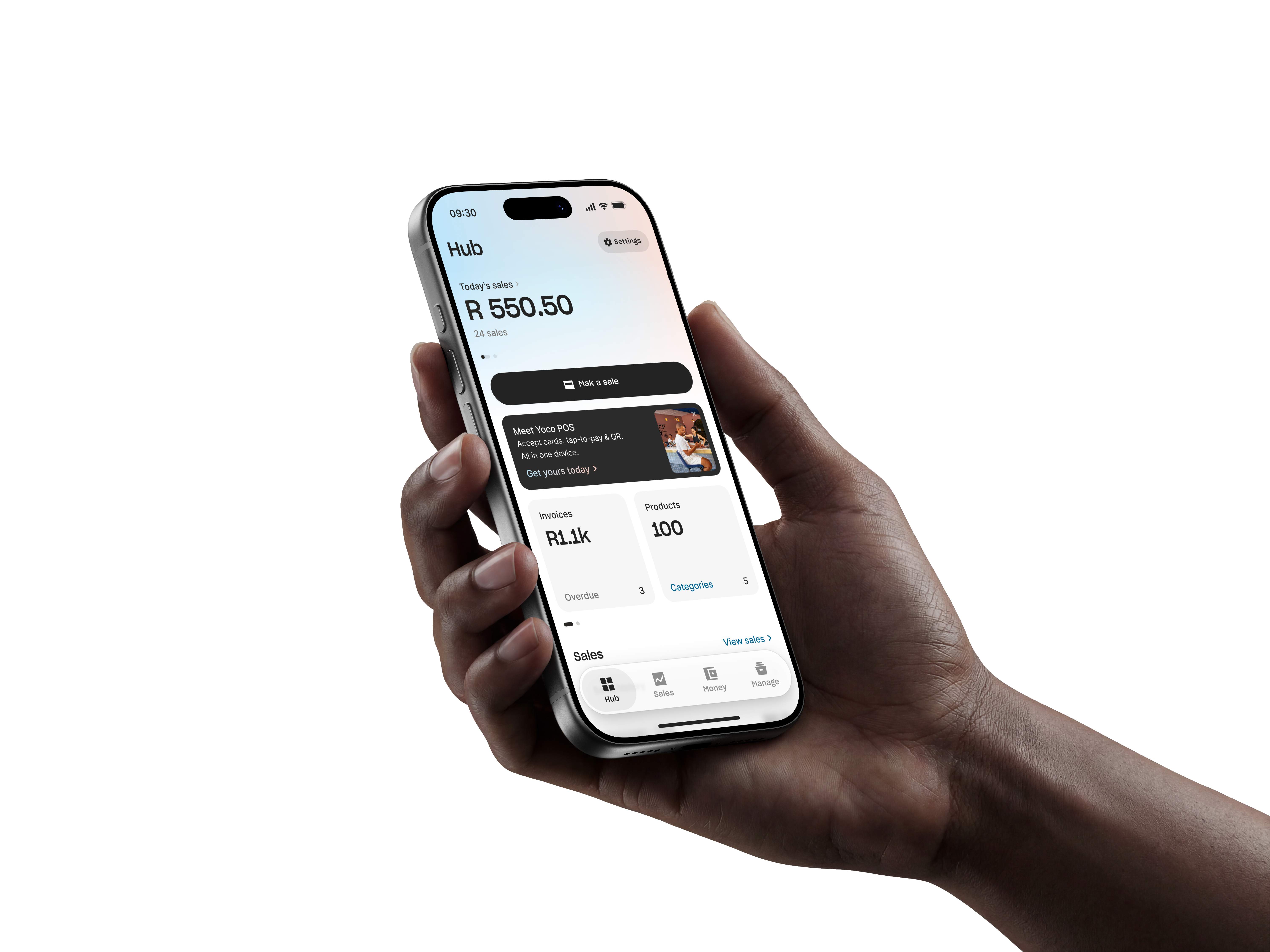
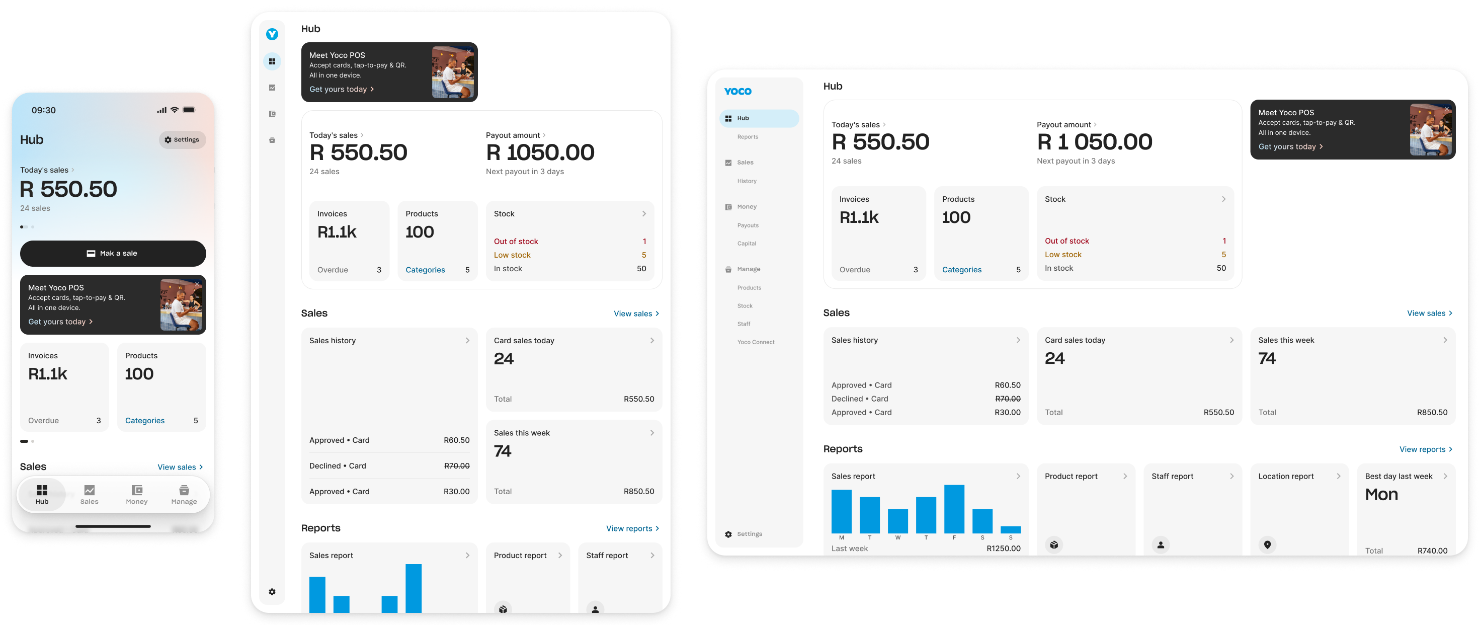
I led the redesign of Yoco’s back-office merchant app with an amazing team, rebuilding it around a new information architecture that brought mobile, tablet and web into one product structure and made existing features easier to discover.
Six months after launch, a merchant told us how much they liked the new stock control feature.
It wasn’t new. It had been there the whole time.
That was the problem we were trying to solve.
What it did
Over six months of gradual rollout:
21%
more first-time visits to features, per active merchant
15%
uplift in support CSAT on app-related tickets
The first number matters most. It means more merchants were opening parts of Yoco they had never used before, exactly what we set out to change.
Support CSAT on app-related tickets improved too. It’s a less direct measure of the redesign, but a useful signal that the product was becoming easier to navigate.
Portal
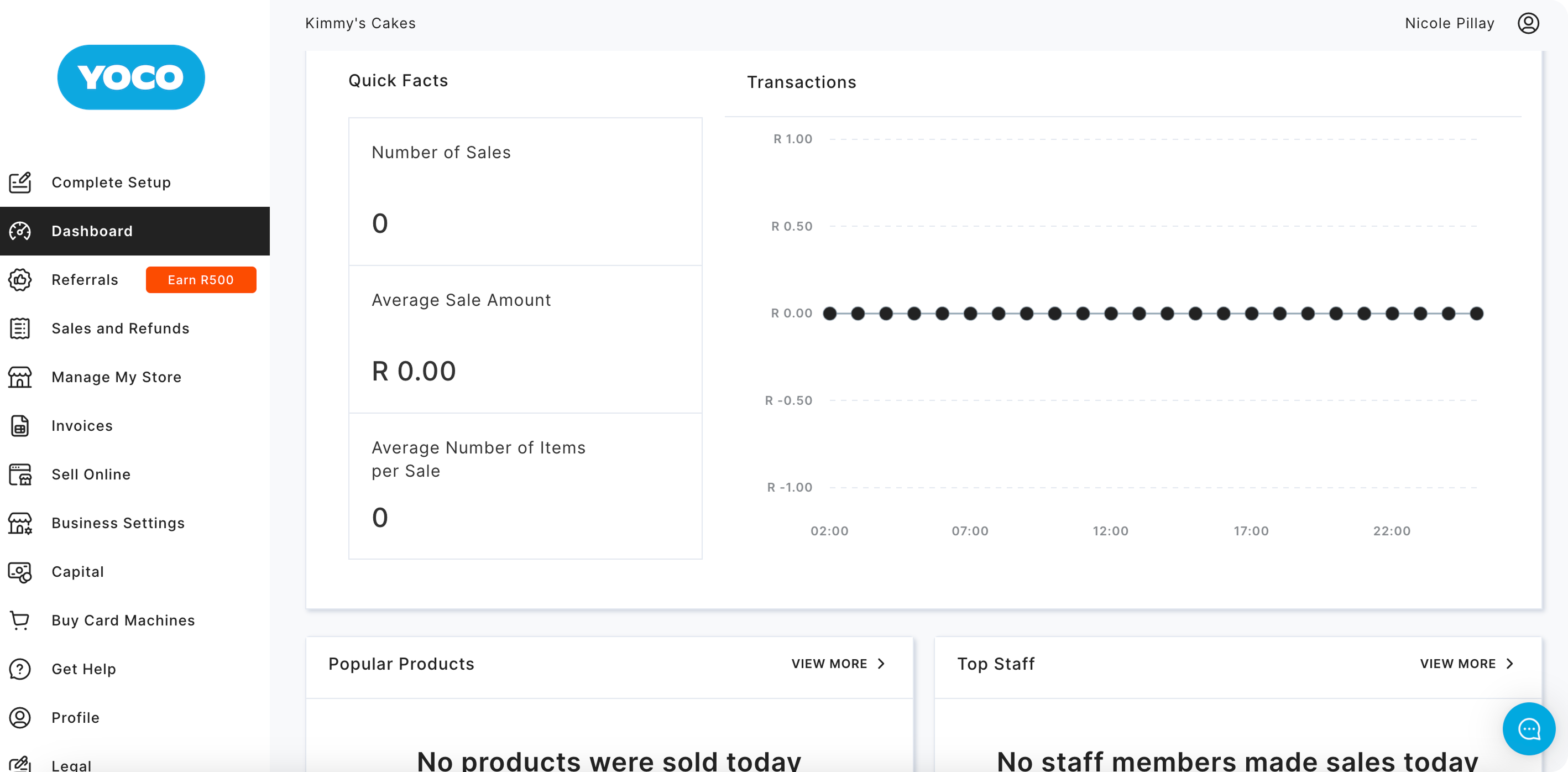
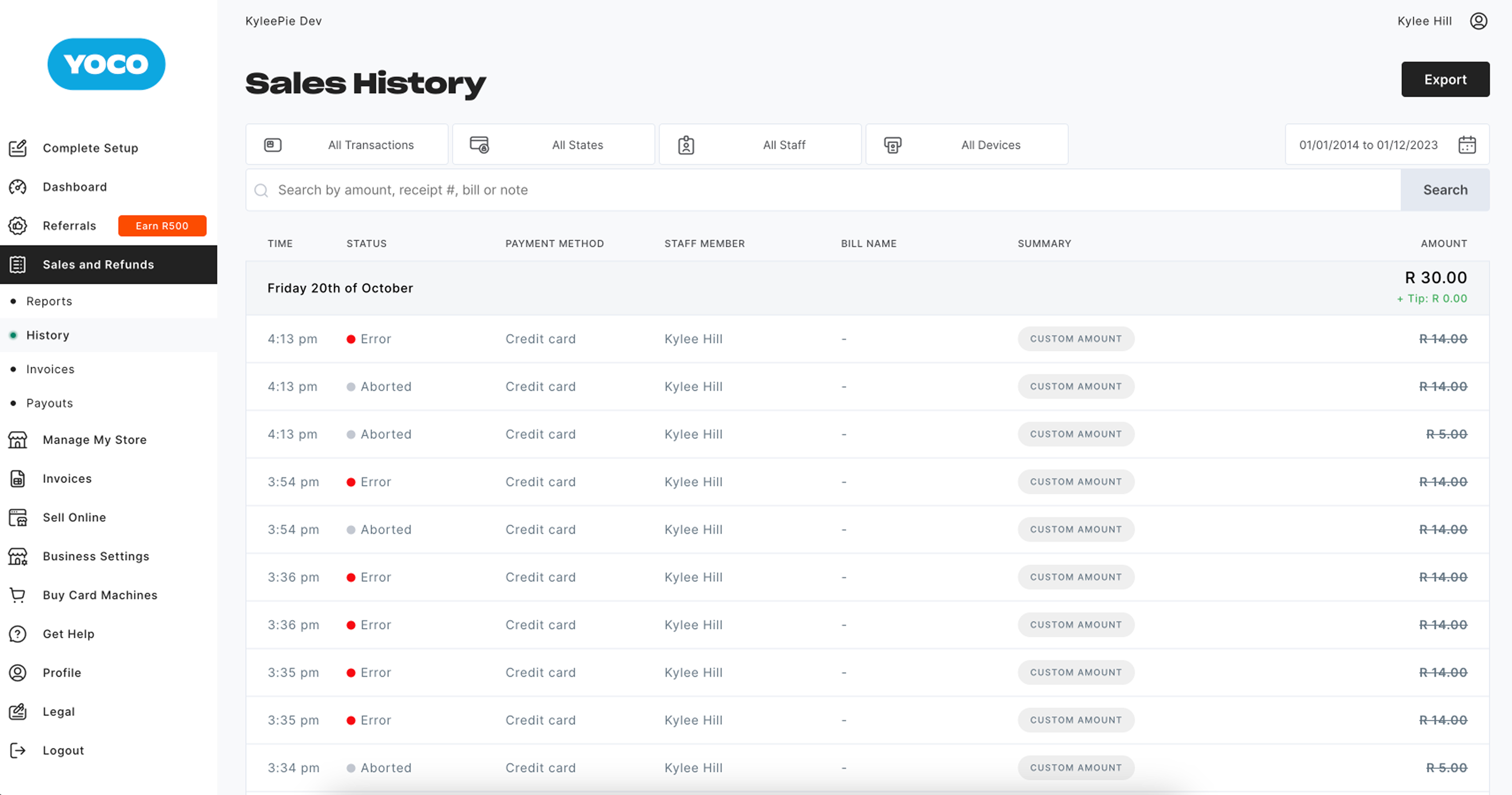
The Yoco app was a web app called Portal, and its navigation was a sidebar. Every new feature added another item; every new product, another entry point.
Thirteen by the end, with some features appearing twice.
A flat list doesn’t gain capacity as it grows, only length. Yoco had a lot more growth coming.
Yoco’s CPO and co-founder put it plainly: the IA was bloated, and it wouldn’t hold what the company wanted to build next.
A hypothesis, then evidence
Yoco serves very different kinds of merchants, so we started with a semantic IA we thought could work across them all: Sales, Manage, Insights, Yoco Account, Profile, Settings.
Then Laura ran open and closed card sorts with merchants.
Merchants didn’t sort things by what they were. They sorted by how often they used them. Some features landed in different places depending on who was sorting; others paired with nothing at all.
- Delete account
- Get help
- Reset password
- Terms & conditions
- Refer a friend
- Buy card machines
- Customers
- Notifications
- Business details
- Capital
- Staff
- Refer a friend
- Customers
- Notifications
- New sale
- Invoices
- Payment links & pages
- Sales reports
- Sales history
- Transaction history
- Make a payment
- Yoco balance transaction history
- Customers
- Products & stock
- Location(s) / store(s)
- Payment gateway / plugins
- My card machines
- Capital
- Buy card machines
- Staff
- Make a payment
- Refer a friend
- Customers
- Notifications
- Payouts
- Log out
- Capital
- Terms & conditions
- Buy card machines
- Yoco balance transaction history
- Refer a friend
- Customers
- Notifications
- Yoco balance
- Sales reports
- Sales history
- Staff
- Transaction history
- Yoco balance transaction history
- Refer a friend
- Customers
- Notifications
There wasn’t one hierarchy everyone agreed on. That was the useful insight.
One home, many doors
The card sort showed that merchants didn’t agree on where things belonged. Where they looked depended on what they were trying to do.
So every feature got one semantic home, with links from wherever else it made sense. That helped us collapse six sections into four — Hub, Sales, Money and Manage — and drop Insights, which merchants found too vague.
Hyperlinks are a technology from the sixties. Why not have things being linked in different places?
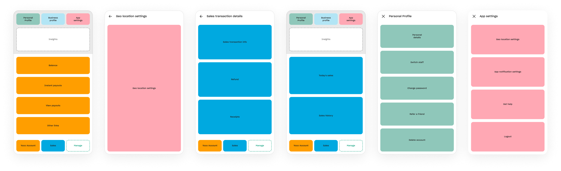
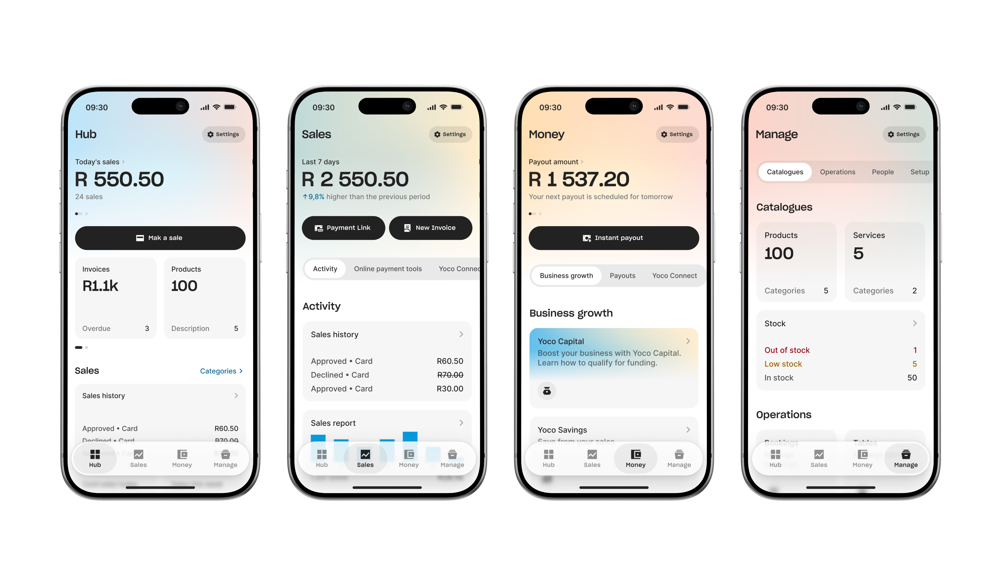
Where Reports landed
With Insights gone, Sales was the place for Reports, but Hub better matched how merchants used them. We anchored them there and linked from Sales.
Windows, not doors
Merchants rarely opened Yoco just to explore. They came with a task already in mind: check a payout, count stock, add a staff member.
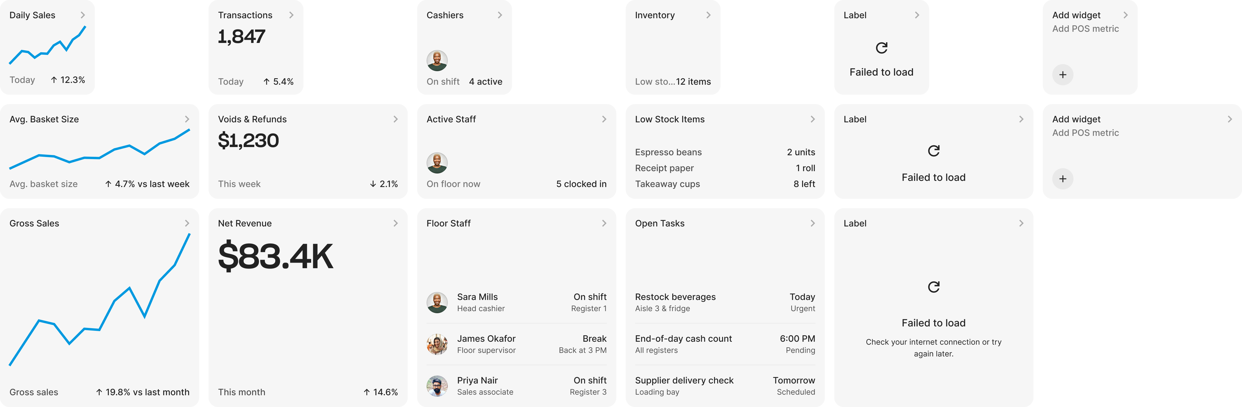
So we made discovery part of the Hub. Widgets didn’t just link to features; they showed what was inside: today’s sales, low stock, top sellers. A merchant could notice something before they knew to look for it.
That’s how an existing feature like stock control could suddenly feel new.
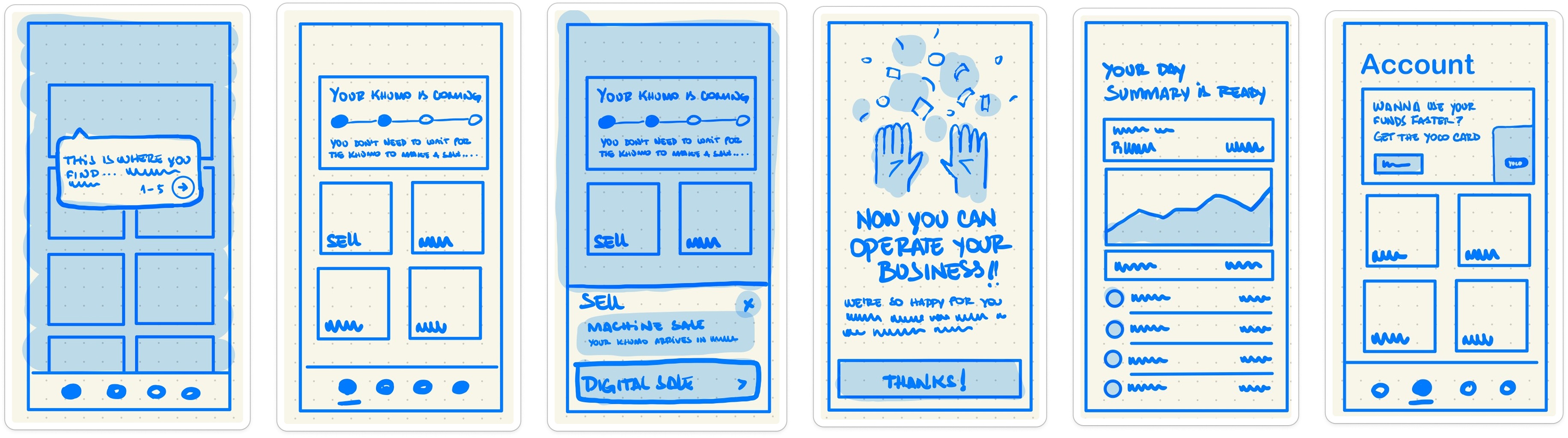
Exploring the edges
We explored a pull-up sheet, an assistant and a customisable Overview. Different ways to make more of the product visible without adding more navigation.
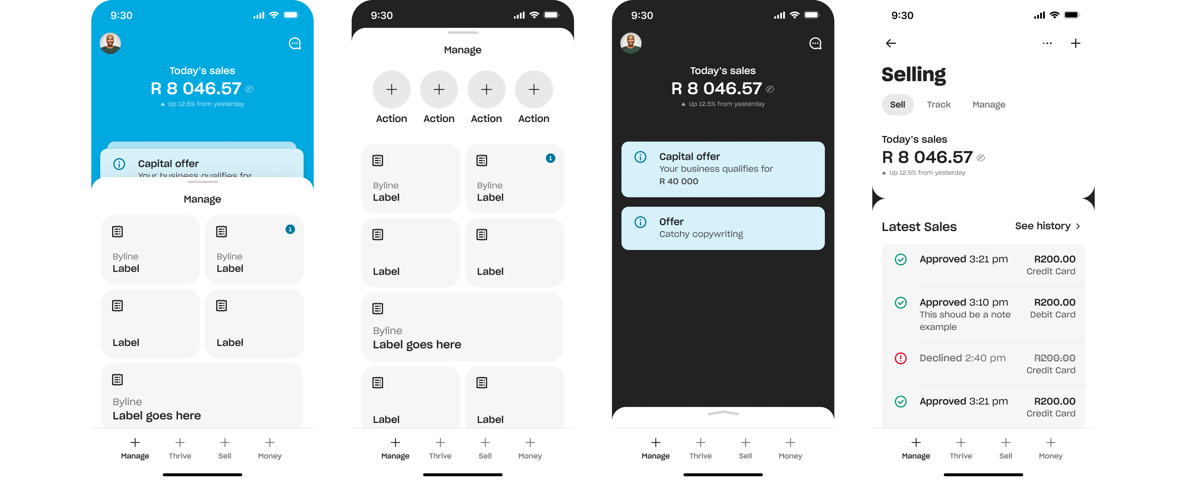
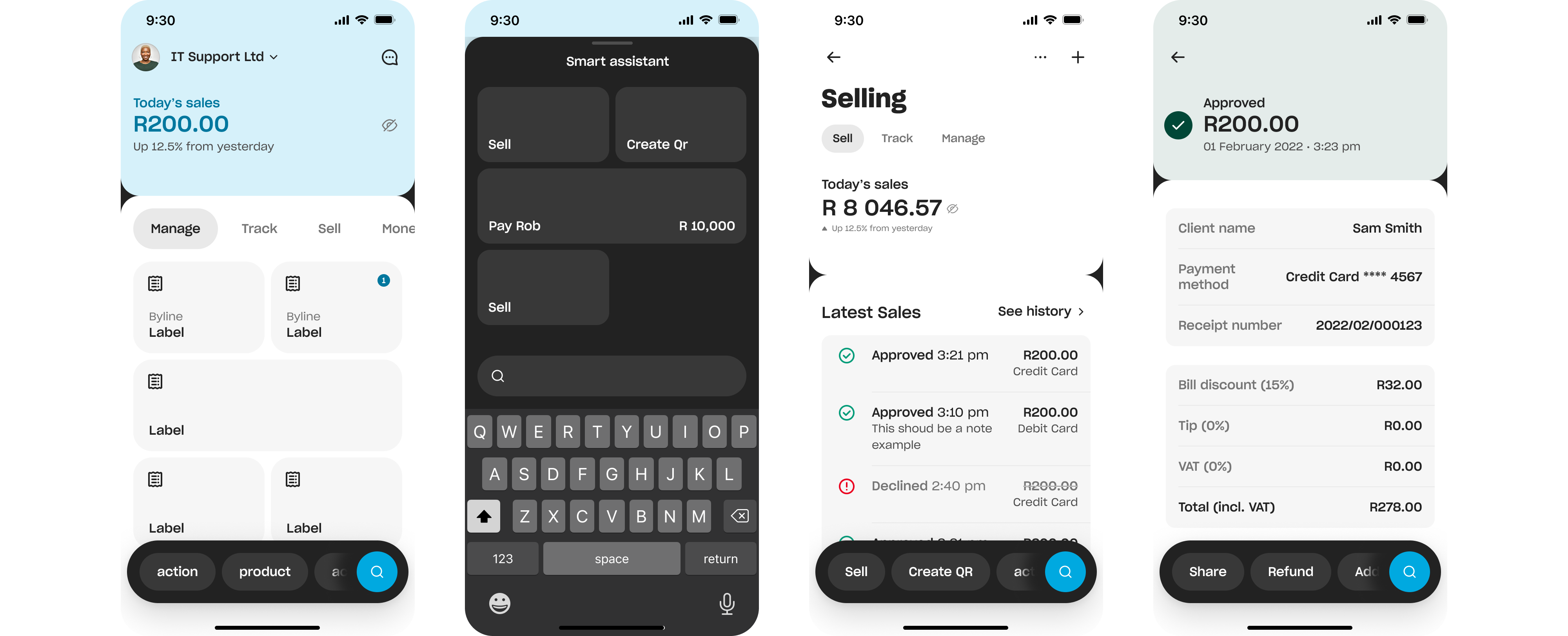
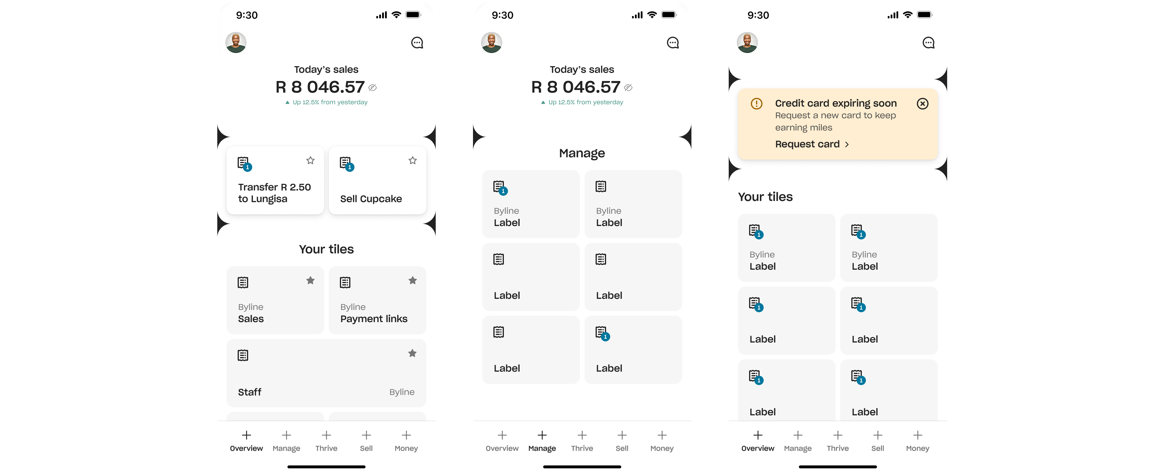
None survived intact. But pieces did: Dean’s themed tabs became the bottom bar, and favourites became the Featured row on Hub.
The system underneath
I was hired to build Yoco’s design system, but standardising a broken structure would only make the inconsistency neater. So we rebuilt the IA and YDS together.
Most components share the same structural baseline, which is why the app reads as one product rather than a collection of screens.
Consistent and considered, even over new and shiny was one of our principles. That’s what it cost: we didn’t get to make each screen special. By the way, Jo wrote them, collecting the team’s feedback and thoughts in a workshop.
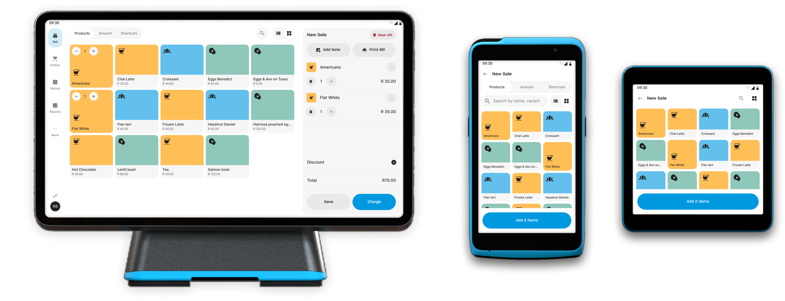
POS and card machines kept their own component libraries, but share the same tokens and primitives. Same foundation, different constraints.
What we got wrong
We split Business and Personal Settings because we expected only one to grow, even though the research suggested merchants saw Profile, Account and Settings as one thing.
Personal Settings never grew. We were right, and it didn’t matter. Findability mattered more, and this was the one place people still got lost.
They’re one Settings now.
What held up
The brief was to build a structure that could absorb what came next.
Three years later, Yoco has added Savings Pockets, Bookings and Tables without changing the four sections. Things moved inside them, Settings merged, but the structure held.
Not everything did. We designed Search, piloted it, then shelved it. Discoverability and onboarding still need work.
The app is changing again now. The point was to make that possible without starting over.