HAR Rentals
Two platforms. One mistake. One lesson.
Ten years ago, I spent two months designing HAR Rentals, a rental search app for Texas, across iPhone, iPad and Android — every screen, and most of the glyphs on them.
It’s the oldest work on this site. I kept it because one small mistake taught me more than most of what I got right.
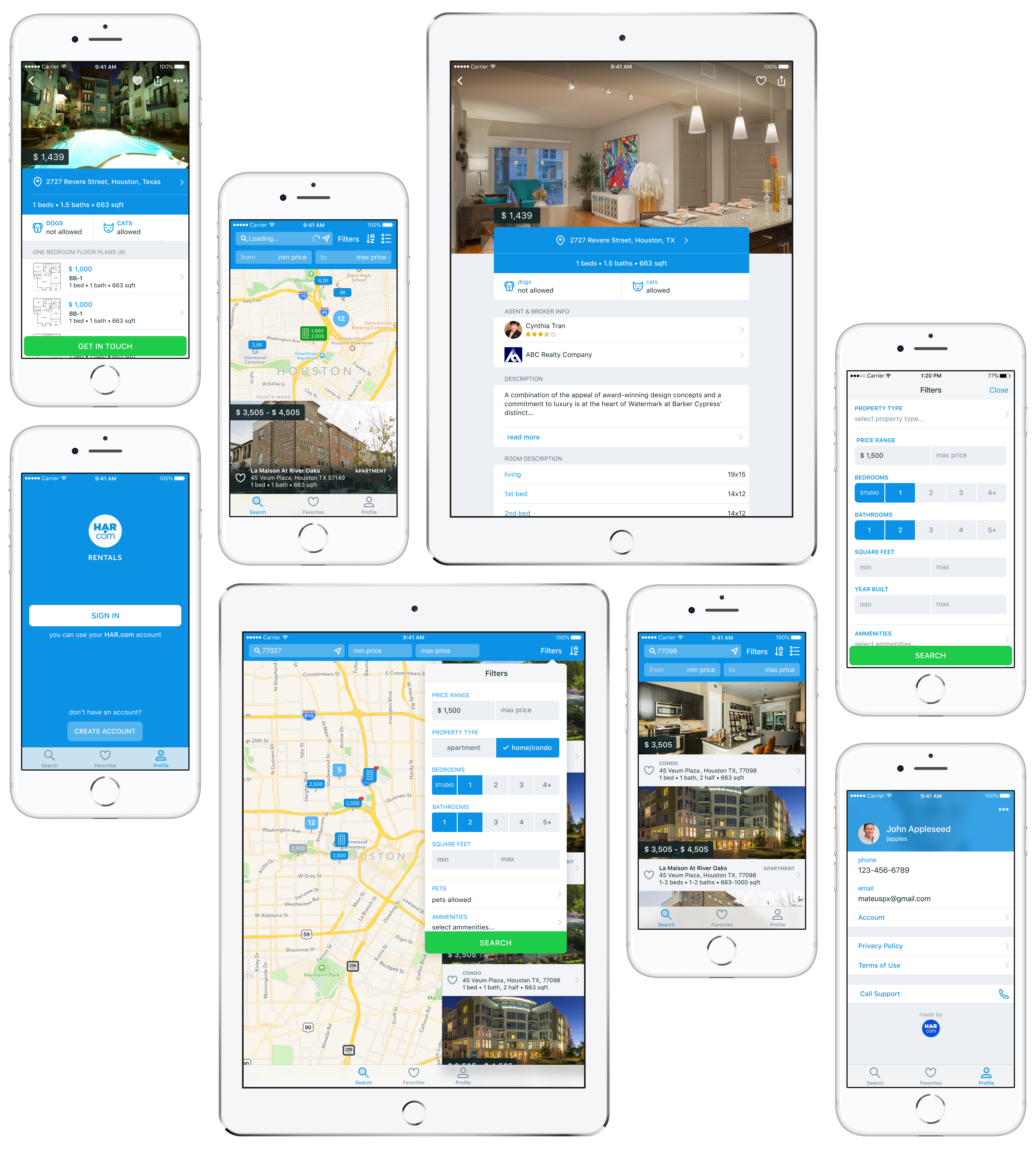
Forty-odd glyphs in total. I remember loving the property pins most: the same information, drawn in the visual language iOS and Android users already knew, with price, property type and saved state. I also drew two faces, one for loading and one for no results. Nobody asked for the faces.
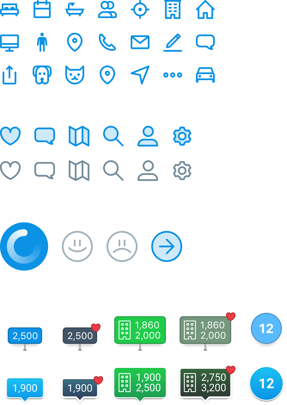
Two idioms
We kept the same architecture across iOS and Android, but followed each platform’s conventions. Same tab bar on both, plus the floating action button Android users expect, which is where filters lived.
Same product, different muscle memory. That difference is what made the mistake later affect only Android users.

Evidence
Usage data from HAR.com’s website and main app showed that price was the filter people used most. So we put min and max directly on the search screen. Change the range and the map updates immediately. It cost some map space, but removed the open, adjust, close, repeat loop.

Instinct
Then I designed the empty state with two helpful buttons: change location, change filters.
iOS users were fine. Android users stopped. I had removed the floating action button they had been using all session and replaced it with something new, right when they were already stuck.
The buttons were clear. That wasn’t the problem. I made them think.
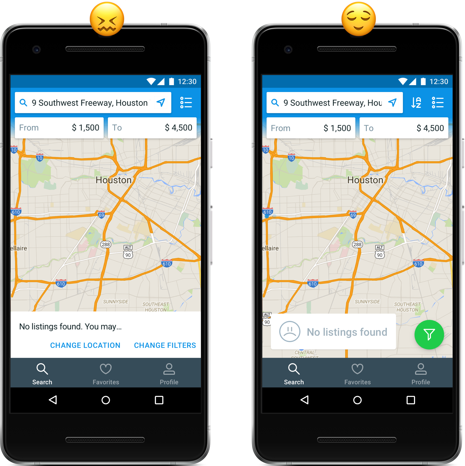
Same instinct as before: remove friction. This time it was a hunch, and it did not survive contact with a person.
Ten years later
A lot of this looks like 2016 now. The platform conventions changed, the visual language changed, and I’d make plenty of different decisions today.
But I still remember watching someone stop at that empty state because of something I had designed. After fifteen years of doing this, those are the moments that stick. Not the screens I got right, but the ones that changed how I design the next one.