Nubank Personal Loans
Transparency drives better decisions.
Ten months, and a textbook double diamond. There was no researcher on the team, so I ran the research as well as the design.
It’s still the project I’m proudest of.

Discover & define
Market analysis
Day one, and we knew almost nothing about personal loans. We went after market reports and found exactly one. Not much — enough for a landscape.
13%
want it approved fastest
17%
have no time to compare
21%
need the instalment to fit
Surveys
The report couldn’t tell us how our own customers differed from everyone else. Surveying our base was the fast, cheap way to find out.
Most people borrow from the bank they already have, after comparing 1.5 institutions.
User interviews
So we brought 14 of the respondents into the office and asked why.
“I can’t understand why they treated me so badly. I went there to pay.”
“I asked for R$1,000 and they charged me R$1,200. It’s absurd.”
Personas
Cooper’s method: personas built on behaviour, with demographics only where they earn their place. Behaviour becomes a persona in three moves.
- Define the rulers — agnostic and clear. Tech savviness, dependence on an account manager, how money gets discussed at home.
- Place every interviewee on every ruler, from what they told us.
- Read the clusters. When 2, 5 and 9 keep landing together, that’s a persona.
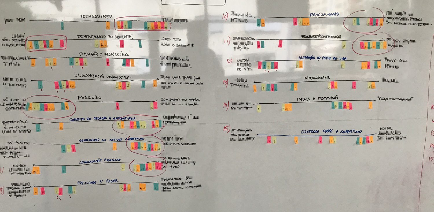

One primary, one secondary — so whatever we designed for Chris would also serve Robbie, with some tailoring.
Design & deliver
Information architecture
There are only three things anyone does with an interface: take information in, change it, and move through it. I mapped the loan that way before drawing a screen.
- Green is what we need from the customer.
- Yellow is what we owe them, so the decision is theirs to make.
- White is a group of related information, not a screen. Relationship, not sequence.
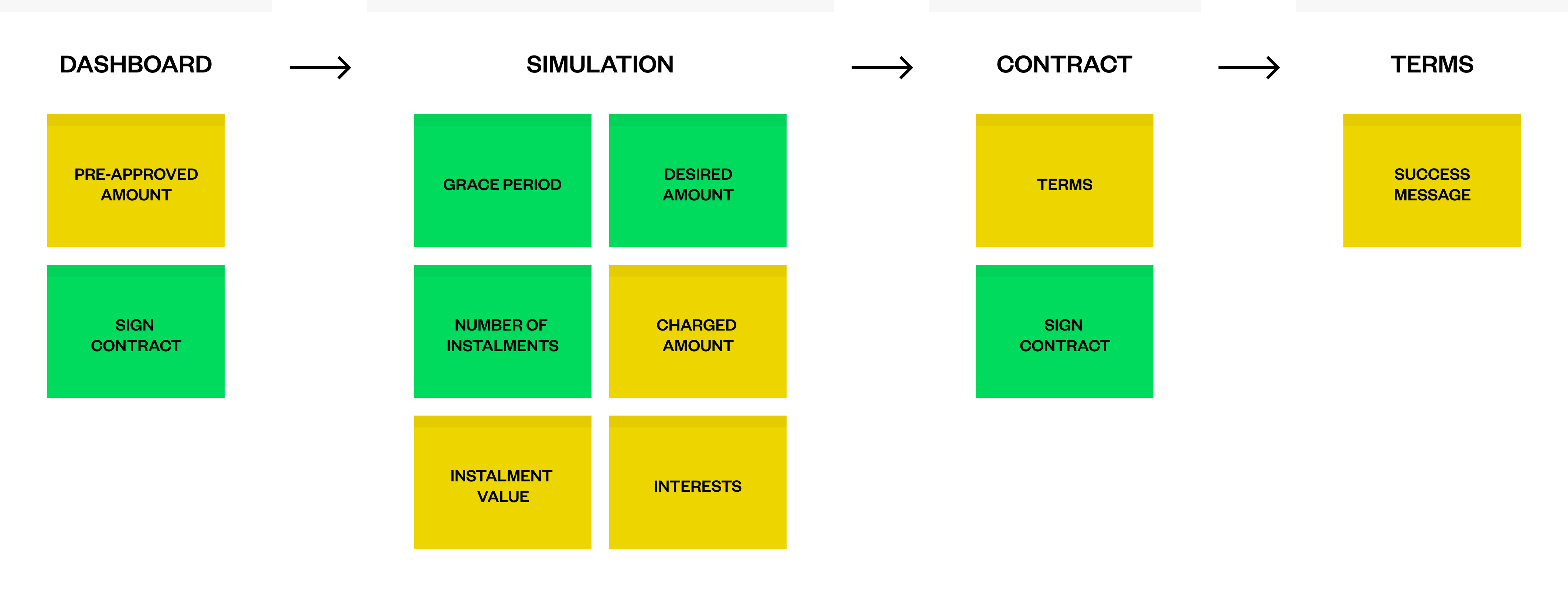
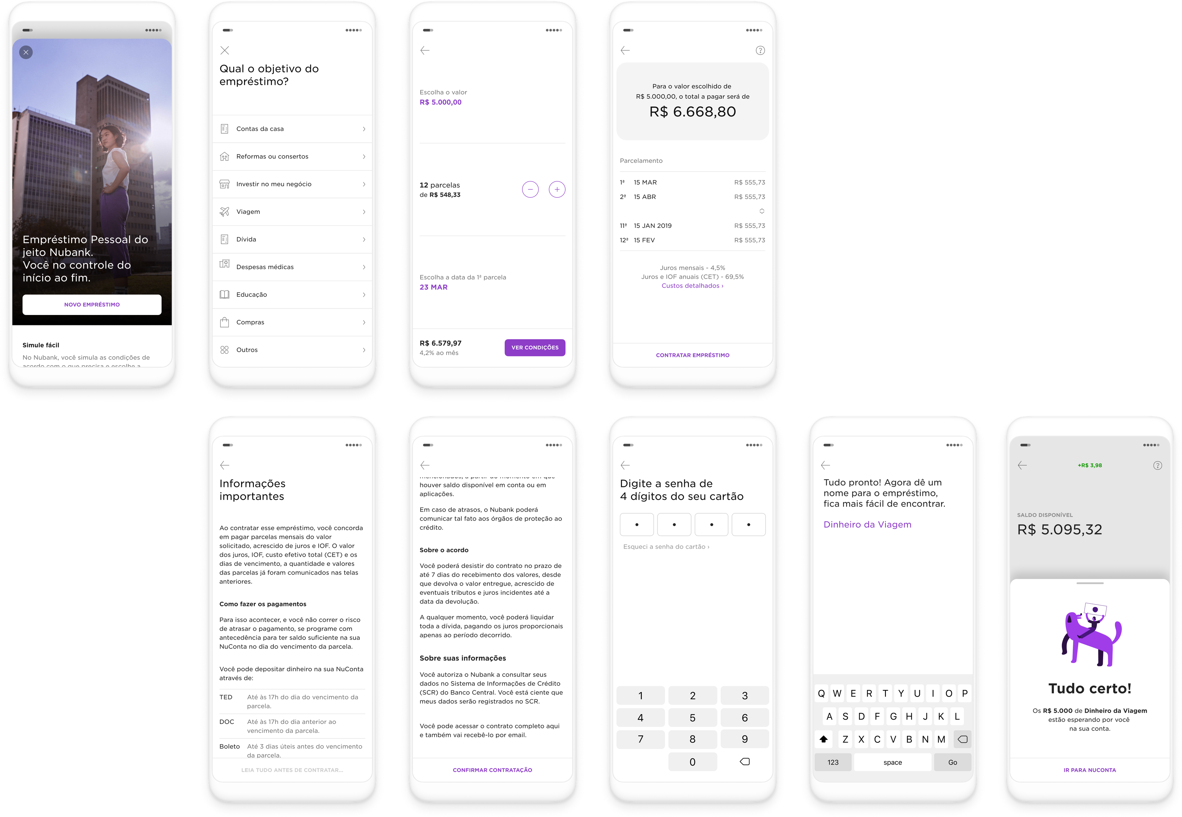
The hiring flow
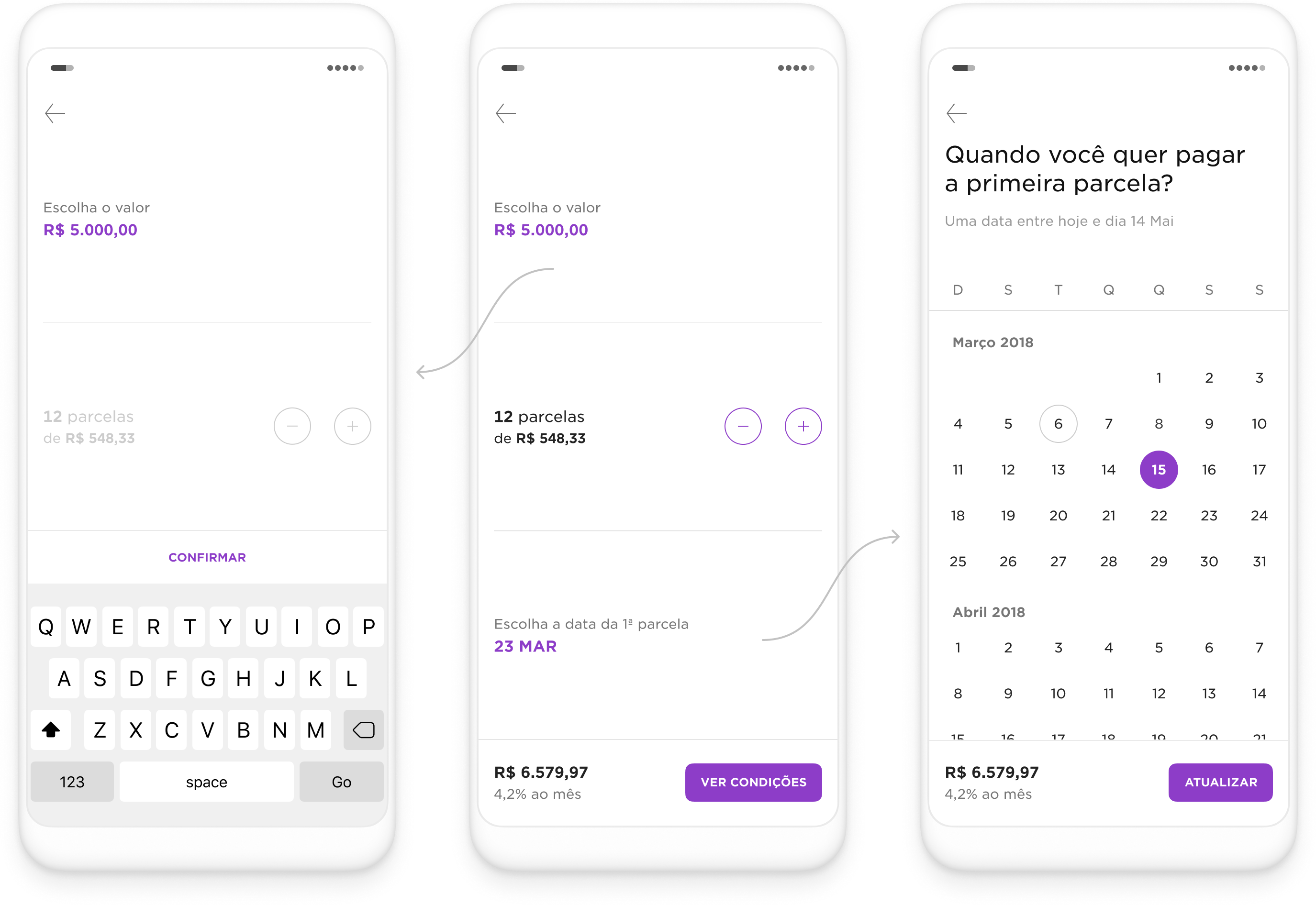
We built three of them: a list of ready-made proposals, a simulator, and a chatbot.
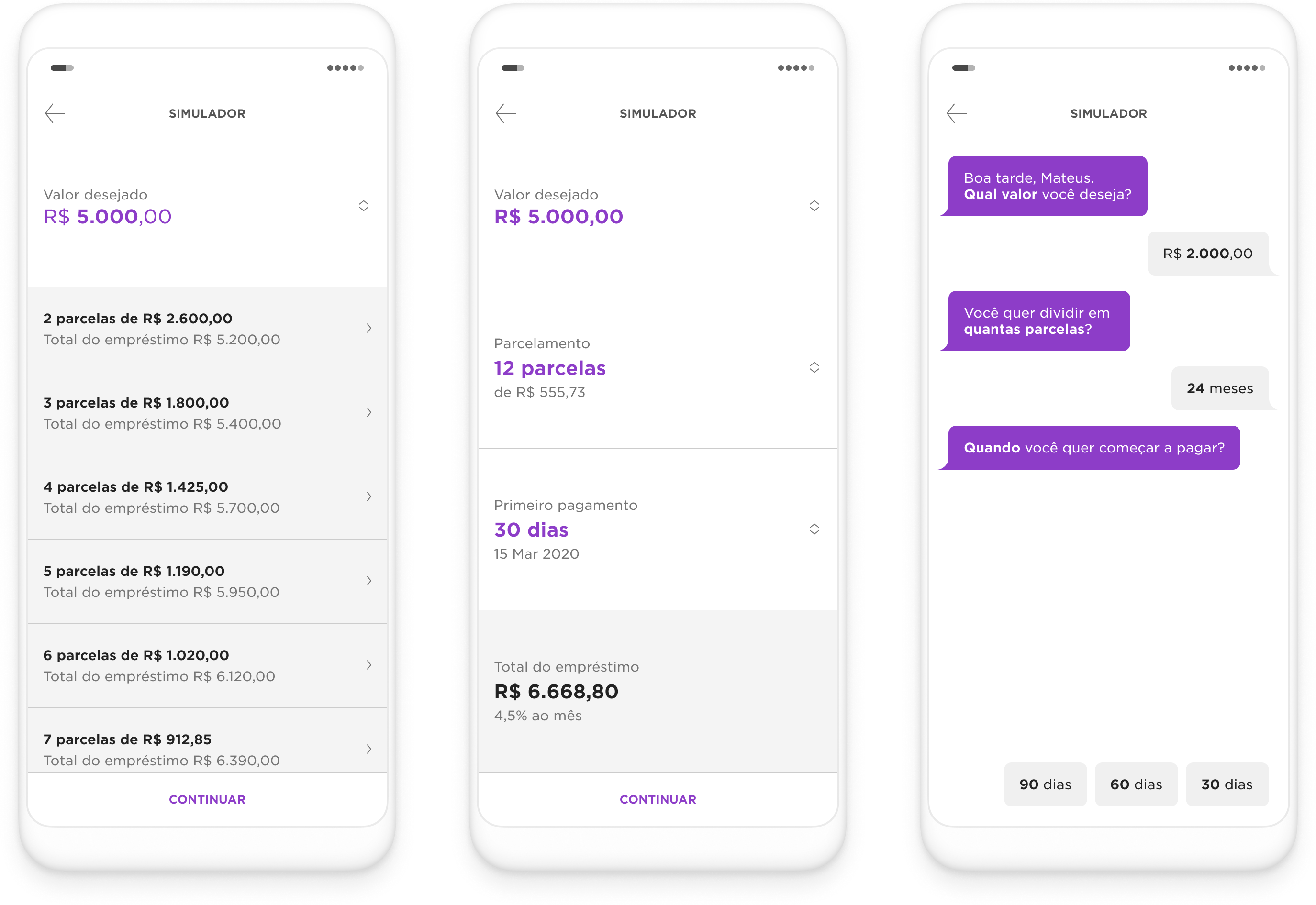
The simulator won. The chatbot was warmer, but too linear to leave anyone feeling in control, and the proposals buried people in numbers.
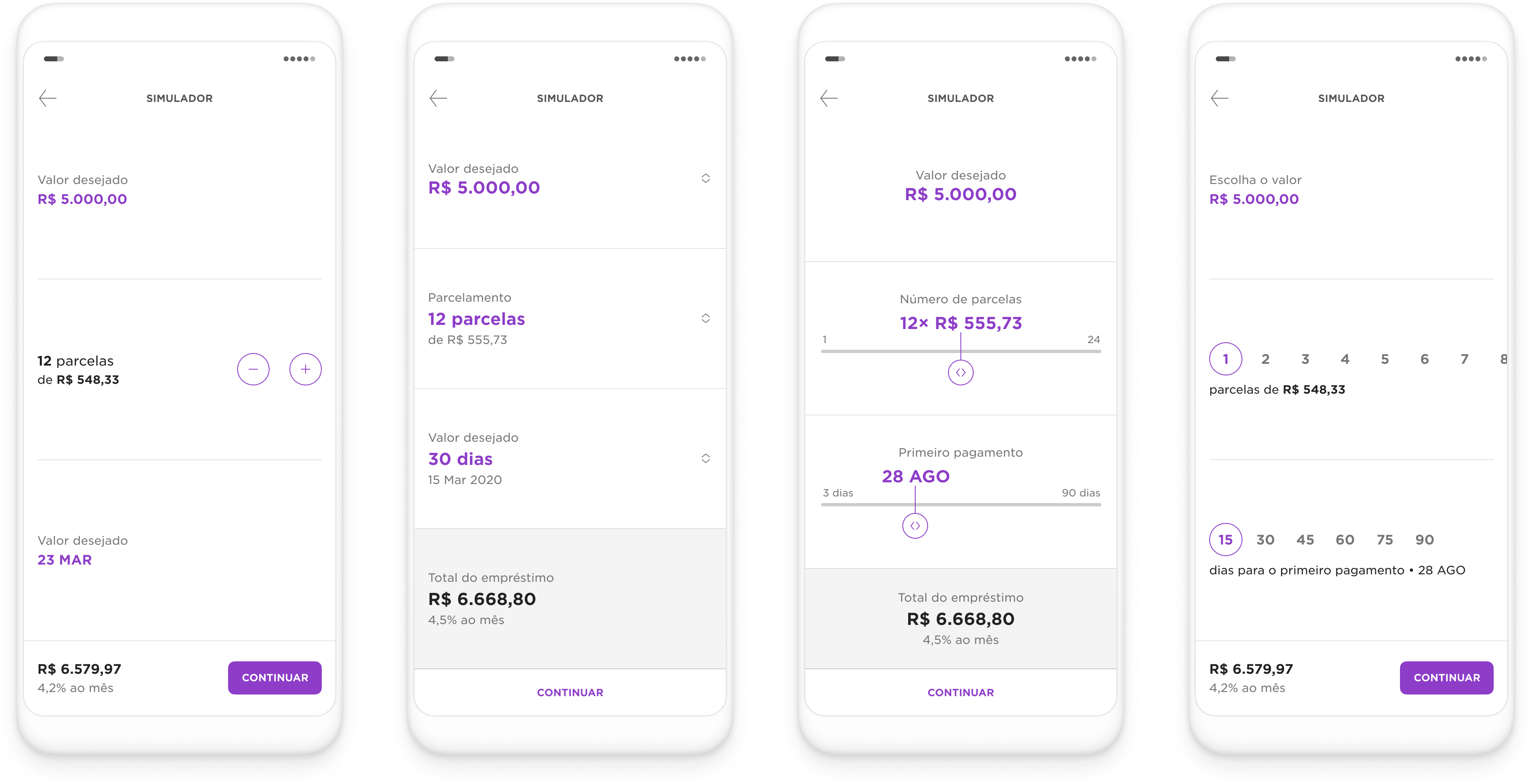
A few rounds later, four simulators went to user testing. The stepper won, and being the plainest of them, it was also the one that held up at every screen height.

The rest of it
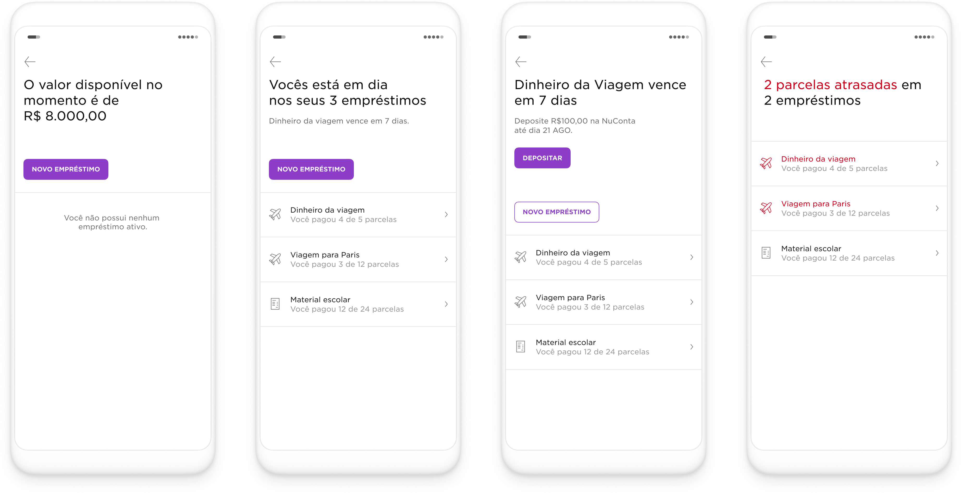
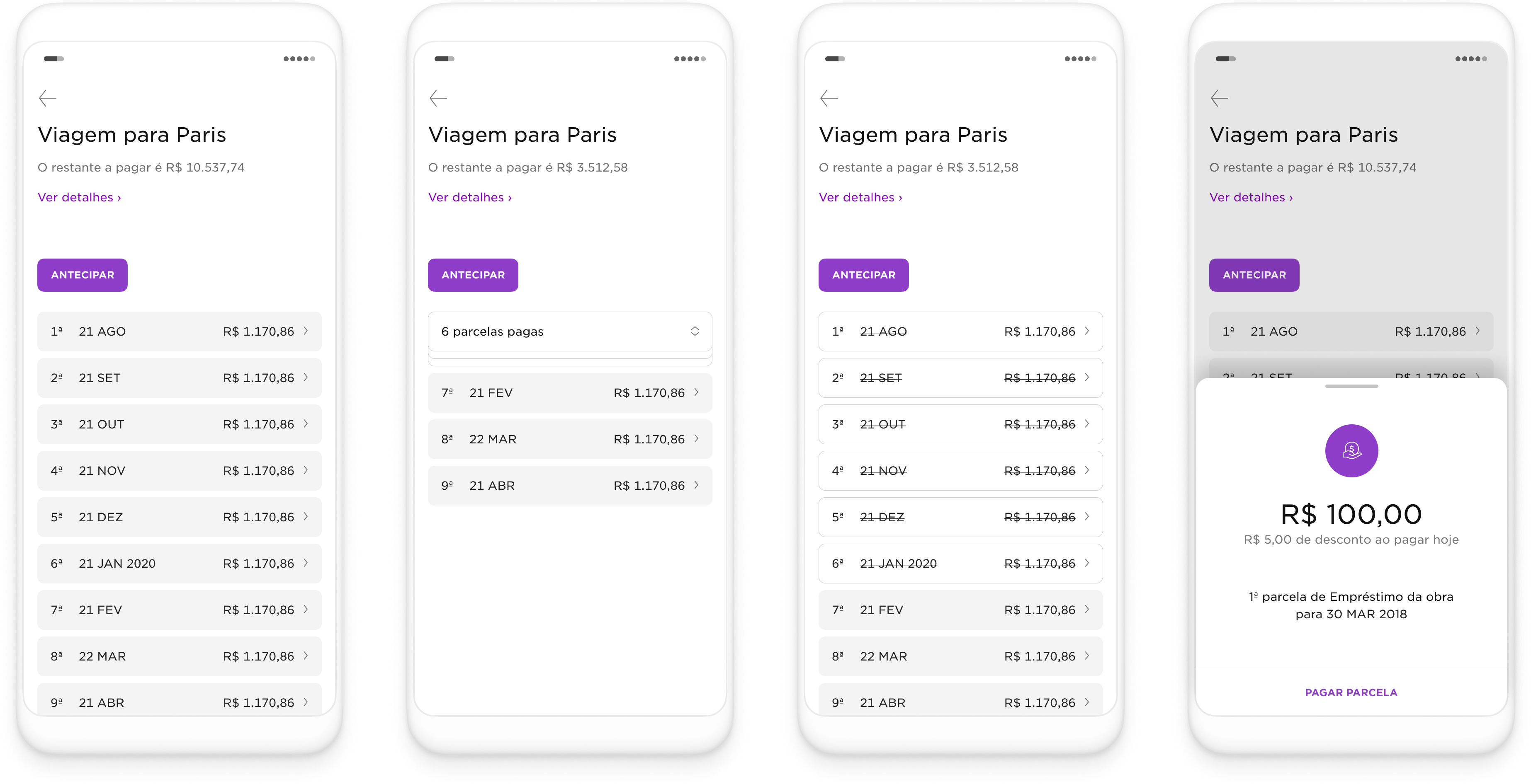
I’ve stayed on the hiring flow to keep this short. Briefly, the rest:

Results
5×
the benchmark, 10× at roll-out
4+
NPS from people who simulated
“I want to thank you all for this dream come true. Yeah, we bought the land. Thank you, thank you, thank you.”